In the field of evolutionary robotics, artificial neural networks (ANNs) are an intriguing control strategy attempting to replicate the functionality of natural brains. These networks, essentially directed graphs, with the possibility for cycles, are comprised of nodes containing a mathematical function, connected by weighted edges. Inputs are correlated with information that may be useful for a robot such as: orientation, speed, goal conditions, etc., which is then propagated through the edges and weights to arrive at a set of outputs to direct motor movements or sensor readings. Unfortunately, the size and complexity of these networks can grow rapidly when anything but the most simple tasks are attempted, making these graphs very challenging to interpret what processes and information are being used by the ANN for controlling the robot. I’ll save the long description of ANNs, but for an idea of what they can do, the following video features an ANN to control a swimming robot in a simulated flow.
In my quest to both understand and communicate what evolved ANNs are doing, along with learning new visualization strategies, I have started to put together a visualization process to show what these ANNs look like. Results so far have been mixed. In the following post, I’ll present my initial steps, some code snippets and commentary on the tools that I have used so far.
Python Code
You can find the code used in this blog at https://github.com/jaredmoore/ANN_Analysis. Rather than go line by line through the code, I will highlight some of the finer points of interest and let you explore the rest. First and foremost, this code is located in NN_Visualizer.py (in case of more files in the future). Currently, the code works with ANNs derived using the NEAT algorithm, so you may need to create your own parser for other formats.
Ranking Nodes
One of the key challenges to creating a sensible diagram of a neural network is creating the hierarchy for many different layers. This is especially necessary in cases where there are many hidden nodes, forming multiple recurrent connections. The algorithm for ranking is fairly simple.
1. Start with the inputs and bias node, place at level 0.
2. Add the placed nodes to a list PLACED_NODES.
3. Proceed through the nodes and identify only those nodes which connect to the inputs and bias. Place at the next level.
4. Add these nodes to PLACED_NODES
5. Continue steps 3 and 4 until there are no more nodes to place.
Writing the ANN in dot
Now that the nodes have been ranked, we can proceed with laying out the ANN. To do this, we will use Graphviz (http://www.graphviz.org/), an open-source tool used to layout different graph formats. Specifically, we will be creating a directed graph with a top-down layout of the ANN. This file is created in the function write_file() in the NN_Visualizer() class.
First and foremost, the nodes must be placed by the previously defined rank. In the dot language, which we use to specify the ANN, this is done by creating subgraphs, wherein each group of nodes is placed in a unique subgraph. In lines 221 – 242 the subgraphs are created with unique styling for each type of node.
for i in xrange(len(self.ranks)):
            if i == 0: # Input
                dest.write('\tsubgraph cluster_'+str(i)+' {\n')
                dest.write('\t    style=invis;\n')
                dest.write('\t    node[shape=box,style=solid,color=blue4];\n')
                dest.write('\t    rank = min;\n')
                dest.write('\t    label = "Layer '+str(i)+' (Input Layer)";\n\t\t')
            elif i == max_rank: # Output
                dest.write('\tsubgraph cluster_'+str(i)+' {\n')
                dest.write('\t    style=invis;\n')
                dest.write('\t    node[shape=circle,style=solid,color=red2];\n')
                dest.write('\t    rank = max;\n')
                dest.write('\t    label = "Layer '+str(i)+' (Output Layer)";\n\t\t')
            else: # Hidden Nodes
                dest.write('\tsubgraph cluster_'+str(i)+' {\n')
                dest.write('\t    style=invis;\n')
                dest.write('\t    node[shape=diamond,style=solid,color=seagreen2];\n')
                dest.write('\t    rank = same;\n')
                dest.write('\t    label = "Layer '+str(i)+' (Hidden Layer)";\n\t\t')
            for node in self.ranks[i]:
                dest.write(str(node)+'; ')
            dest.write('\n\t}\n\n')
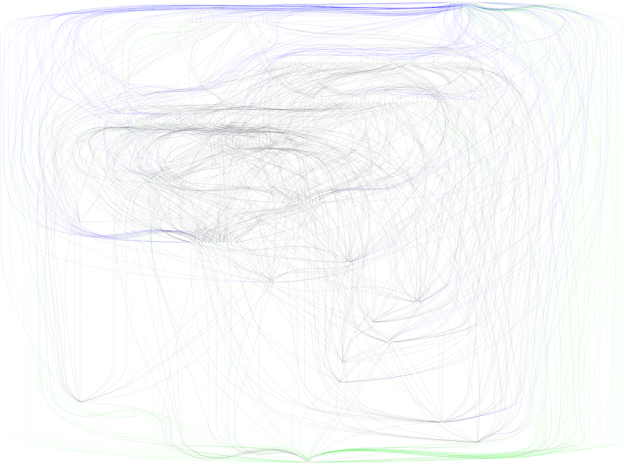
As you can see, different nodes types feature unique styling, options which can be found in the Graphviz documentation. Here, I have chosen to make hidden nodes diamonds with a seagreen color (line 237).
While the subgraphs are pretty straightforward, placing the links ends up being somewhat tricky and requires some hacking in order to get dot to play nice with the graph. ANNs often contain links that go every which way, resulting in cycles or links between nodes ranked on the same level. Without cycles, we could place each subsequent node in a chain on a new layer, however, cycles result in some required trickery in order to properly include them in our plot without just placing all hidden nodes in one layer. The ranking function handles these cycles, but to place them into our dot file, we must do some modification rather than just naming the source and destination nodes for a link.
        # Write out each node connection to the file.
        for key, links in self.nn_links.iteritems():
            for key, link in links.iteritems():
                comma = 0 # Keep track of whether we need a prepended comment to style insertions or not.
                # Check to see if the node goes backwards up the ranking.
                # If so, flip src and dest and then reverse the arrow.
                # Allows for better layout of ANN
                if self.nn_nodes[link.link_src].node_level > self.nn_nodes[link.link_dest].node_level:
                    dest.write('\t'+str(link.link_dest)+' -> '+str(link.link_src)+'[dir=back')
                    comma = 1
                # Check to see if the nodes are on the same level.
                # If so, set constraint property of link to false so nodes stay on same level.
                elif self.nn_nodes[link.link_src].node_level == self.nn_nodes[link.link_dest].node_level:
                    dest.write('\t'+str(link.link_src)+' -> '+str(link.link_dest)+'[constraint=false')
                    comma = 1
                else:
                    dest.write('\t'+str(link.link_src)+' -> '+str(link.link_dest)+'[')
                if self.nn_nodes[link.link_dest].node_type == 2: # Output Node as Destination
                    if comma == 1:
                        dest.write(',')
                    dest.write('color=green') # Set link color to green.
                elif self.nn_nodes[link.link_dest].node_type == 0 and self.nn_nodes[link.link_src].node_type == 1: # Input to Hidden
                    if comma == 1:
                        dest.write(',')
                    dest.write('color=blue') # Set link color to blue.
                dest.write('];\n')
Cycles are generally handled by detecting where the link is that goes from a node on a higher numbered rank (lower in the resultant plot) to a lower numbered rank. Here, lines 257 and 258 detect when this condition occurs and swaps the source and destination nodes. The dir attribute is then set to back allowing the link to appear to go from destination to source, creating the illusion of a cycle to an outside observer.
Connections on the same level are handled similarly with another attribute constraint set to false.
Putting it all together
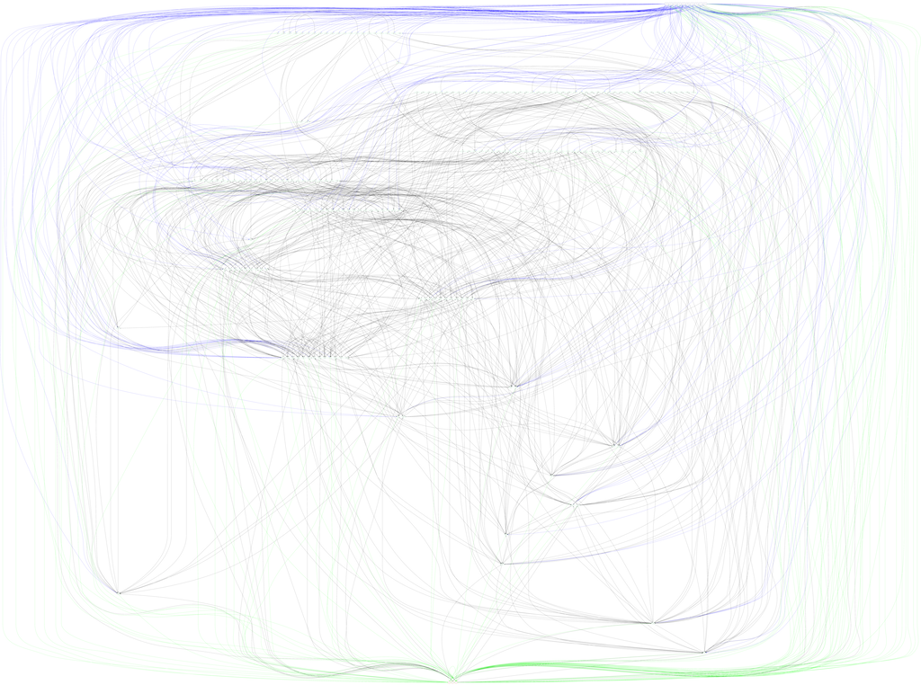 If you have downloaded the code from Github, you can see the resulting neural network by running the sequence of commands found in the README. Of course, you can also just view the image I have included in this post. Unfortunately, the code currently outputs a very large, very unattractive bowl of spaghetti that is actually a neural network. Sorry for stringing you along this far, but I did mention in the title that this is an adventure in neural network visualization!
For now, this is the end of the visualization, with some additional style that I haven’t covered. See the colored links? In the future, I plan to investigate better methods to refine the structure of the network, and possibly simplify the output plot. Even so, the output of plotting is quite insightful into the complexity and size of even simple evolved artificial neural networks!