Category Archives: Python

Bokeh or Holoviews and Chromedriver not found.

chromedriver becomes an impediment to generating png files from Bokeh and Holoviews.  It seems that chromedriver and Chrome are tied in terms of versions, so in between working on visualization projects Chrome updates and the old chromedriver doesn’t work.  This requires downloading a new chromedriver based on the currently installed Chrome version from https://chromedriver.chromium.org/getting-started.

Once there, move the downloaded chromedriver that matches your Chrome version into a folder on your path.  “/usr/local/bin” is one possible location.  Then approve the security settings when trying to run it the first time and you should be good to generate plots going forward.

A pesky issue that crops up, but not too bad if you write a blog post to remind future self what you just spent 20 minutes troubleshooting 🙂  (Or write a blog post after the third time you’ve had to figure out how to do this again!)

A handy code snipped to test chromedriver outside of working with a plot:

from selenium import webdriver

driver = webdriver.Chrome() # Optional argument, if not specified will search path.

driver.get('http://www.google.com/');

Of course, this code presupposes you placed chromedriver in a folder on your system PATH.

Bokeh Boxplot Color by Factor and Legend Outside Plot

The current version of Bokeh 0.12.10 broke some previous functionality for boxplots and required building a boxplot from the ground up. Unfortunately, the example code provided in the user guide colors each box based on the upper and lower boxes, rather than by the factor value. This example code instead colors by factor, and places the legend outside the bounding box. Full source code of this notebook is provided at: Bokeh Notebook Example.

First, we import the required packages, primarily pandas and bokeh.

import pandas as pd
import random

from bokeh.io import output_notebook
from bokeh.plotting import figure, output_file, show
from bokeh.models import ColumnDataSource

Next, we create some sample data. Not the most interesting, but formatting by factor and value allows us to create the boxplot.

# Generate some synthetic data.
df = pd.DataFrame({
    'Treatment':[str(i) for i in range(4) for j in range(100)],
    'y':[random.gauss(i, 0.5) for i in range(4) for j in range(100)]
})
df.head()

Now that we have some data, we first need a way to figure out how many colors we need. I wrote this convenience function to look at the data frame and figure out how many unique values are in the given column. Thus, we are coloring based on that column and pulling from the Spectral template built into bokeh.palettes. This function was adapted from the links provided in the code comments.

from bokeh.palettes import brewer
def color_list_generator(df, treatment_col):
    """ Create a list of colors per treatment given a dataframe and 
        column representing the treatments.
        
        Args:
            df - dataframe to get data from
            treatment_col - column to use to get unique treatments.
                
        Inspired by creating colors for each treatment 
        Rough Source: http://bokeh.pydata.org/en/latest/docs/gallery/brewer.html#gallery-brewer
        Fine Tune Source: http://bokeh.pydata.org/en/latest/docs/gallery/iris.html
    """
    # Get the number of colors we'll need for the plot.
    colors = brewer["Spectral"][len(df[treatment_col].unique())]

    # Create a map between treatment and color.
    colormap = {i: colors[k] for k,i in enumerate(df[treatment_col].unique())}

    # Return a list of colors for each value that we will be looking at.
    return [colormap[x] for x in df[treatment_col]]

The full code for the boxplot creating is below. We first get the colors needed for the treatments, four in our case. Next, get the categories we will be plotting by. Quartiles and interquartile range are then calculated. ‘upper_source’ and ‘lower_source’ are ‘ColumnDataSource’ objects needed to create the upper and lower quartile boxes for the boxplot. They are essentially dictionaries but with additional features documented in Bokeh. Here we specify not only the treatment values, but also the colors that we will fill each box by. Outliers are then identified and kept in their own data source.

The key insight of the Bokeh process is that the boxplot is built up by components, whiskers, vertical lines and boxes. Each of these calls is made using ‘segment’, ‘vbar’, and ‘rect’ calls. However, even though we have multiple treatments, by using the ‘ColumnDataSource’ objects, we are able to make one call to create a geom object for each treatment.

Finally, placing the legend outside the plot requires a bit of wrangling. This new feature in more recent versions of Bokeh is not well documented. We must build the legend ourselves and then place it manually. This can be done in two lines of code. The first creates the ‘Legend’ object by using the ‘vbar’ return renderer saved in the ‘l’ variable. Combining this with the ‘ColumnDataSource’ provided to the original renderer, we create the legend with four values, each corresponding to a treatment. Finally, we add the legend to the plot manually.

# Generate a boxplot of the maximum fitness value per treatment.
import numpy as np

from bokeh.models import Legend, LegendItem
from bokeh.plotting import figure, show, output_file

output_notebook()

# Get the colors for the boxes.
colors = color_list_generator(df, 'Treatment')
colors = list(set(colors))

# Get the categories that we will be plotting by.
cats = df.Treatment.unique()

# find the quartiles and IQR for each category
groups = df.groupby('Treatment')
q1 = groups.quantile(q=0.25)
q2 = groups.quantile(q=0.5)
q3 = groups.quantile(q=0.75)
iqr = q3 - q1
upper = q3 + 1.5*iqr
lower = q1 - 1.5*iqr

# Form the source data to call vbar for upper and lower
# boxes to be formed later.
upper_source = ColumnDataSource(data=dict(
    x=cats, 
    bottom=q2.y,
    top=q3.y,
    fill_color=colors,
    legend=cats
))

lower_source = ColumnDataSource(data=dict(
    x=cats, 
    bottom=q1.y,
    top=q2.y,
    fill_color=colors
))

# find the outliers for each category
def outliers(group):
    cat = group.name
    return group[(group.y > upper.loc[cat]['y']) | (group.y < lower.loc[cat]['y'])]['y']
out = groups.apply(outliers).dropna()

# prepare outlier data for plotting, we need coordinates for every outlier.
if not out.empty:
    outx = []
    outy = []
    for cat in cats:
        # only add outliers if they exist
        if not out.loc[cat].empty:
            for value in out[cat]:
                outx.append(cat)
                outy.append(value)

p = figure(tools="save", title="", x_range=df.Treatment.unique())

# stems (Don't need colors of treatment)
p.segment(cats, upper.y, cats, q3.y, line_color="black")
p.segment(cats, lower.y, cats, q1.y, line_color="black")

# Add the upper and lower quartiles
l=p.vbar(source = upper_source, x='x', width=0.7, bottom='bottom', top='top', fill_color='fill_color', line_color="black")
p.vbar(source = lower_source, x='x', width=0.7, bottom='bottom', top='top', fill_color='fill_color', line_color="black")

# whiskers (almost-0 height rects simpler than segments)
p.rect(cats, lower.y, 0.2, 0.01, line_color="black")
p.rect(cats, upper.y, 0.2, 0.01, line_color="black")

# outliers
if not out.empty:
    p.circle(outx, outy, size=6, color="#F38630", fill_alpha=0.6)

# Using the newer autogrouped syntax.
# Grab a renderer, in this case upper quartile and then
# create the legend explicitly.  
# Guidance from: https://groups.google.com/a/continuum.io/forum/#!msg/bokeh/uEliQlgj390/Jyhsc5HqAAAJ
legend = Legend(items=[LegendItem(label=dict(field="x"), renderers=[l])])

p.add_layout(legend, 'below')    

# Setup plot titles and such.
p.title.text = "Boxplot with Colored Treatments and Legend Outside Plot"
p.xgrid.grid_line_color = None
p.ygrid.grid_line_color = "white"
p.grid.grid_line_width = 2
p.xaxis.major_label_text_font_size="0pt"
p.xaxis.major_label_orientation = np.pi/4
p.xaxis.axis_label="Treatment"
p.yaxis.axis_label="y"
p.legend.location = (100,10)

show(p)

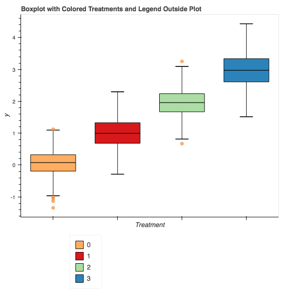
The final result should look something like this:

bokeh_plot

While perhaps not the most straightforward process compared to other plotting packages, Bokeh gives us the ability to build plots optimized for the web and additional features over just a static object. This code can of course be wrapped in a function and made part of a library, but that will be upcoming.

Color Points by Factor with Bokeh

Bokeh (https://bokeh.pydata.org/en/latest/) has been on my radar for some time as I move my data processing primarily to Jupyter notebooks.  The look and feel of the plots have sensible defaults and generally are visually pleasing without too much customization.  Compared to matplotlib, I find that I need to do much less customization to get my final product.

Unfortunately, sometimes the process of generating a plot isn’t a one-to-one mapping with my prior experiences.  One such area of difficulty recently was generating a plot with four treatments, coloring each group of circles independently.  After much trial and error, the following code generated a rough plot I was happy with.

from bokeh.io import output_notebook
from bokeh.palettes import brewer
from bokeh.plotting import figure, show
import pandas

# Assumes df => data frame with columns: X_Data, Y_Data, Factor

# Create colors for each treatment 
# Rough Source: http://bokeh.pydata.org/en/latest/docs/gallery/brewer.html#gallery-brewer
# Fine Tune Source: http://bokeh.pydata.org/en/latest/docs/gallery/iris.html

# Get the number of colors we'll need for the plot.
colors = brewer["Spectral"][len(df.Factor.unique())]

# Create a map between factor and color.
colormap = {i: colors[i] for i in df.Factor.unique()}

# Create a list of colors for each value that we will be looking at.
colors = [colormap[x] for x in df.Factor]

# Generate the figure.
output_notebook()
p = figure(plot_width=800, plot_height=400)

# add a circle renderer with a size, color, and alpha
p.circle(df['X_Data'], df['Y_Data'], size=5, color=colors)

# show the results
show(p)

The general process is to first get a color palette from bokeh.palettes.brewer.  I selected the number of colors based on how many unique values existed in the Factor column.  Then I created a map from the values in the column and the colors.  Next, create a new list that maps each data point to a color, and use this when plotting using the circle call.

You should get something similar to the following figure based on what data you have to import.  Enjoy!

Add color to your plots by factor!

Add color to your plots by factor!

(Bokeh 0.12.7)

Genetic Algorithm with Multiple ROS Instances

Note: Source code discussed in this post is available here.  Specifically, we’ll be working with the adding_service ROS package.

Genetic algorithms are “pleasantly parallel” in that the evaluation phase can be distributed across multiple cores of a single machine or a cluster to better utilize hardware and lower running time of the algorithm.  When working with ROS, however, there are some platform specific considerations that need to be made in order to fully exploit parallel evaluations.

In this blog post, we will explore a genetic algorithm that evolves a genome of floats to maximize their sum.  ROS will perform the addition while a Python implementation of a GA will be run outside the scope of ROS.  The GA will communicate with ROS instances through the use of ZeroMQ messages.  This code is intended to provide a minimal working example of how to pass a genome into ROS and retrieve fitness values out.  It can be extended by a user as needed to implement more complex evaluations or a more advanced GA.

Communicating between External GA and ROS Instance

During an evaluation, information is passed between the external GA and the ROS instance through a combination of ZeroMQ messages (external) and ROS parameters and topics (internal).  The flow of information can be seen in the following diagram for a single evaluation.  Adder_Transporter handles the message passing and Adder_Worker handles the actual evaluation.

This is the information flow between a GA and ROS instance for a single evaluation. The GA sends the genome over a ZeroMQ message. A transport node handles the message, loads the genome into a ROS parameter and then alerts the worker that there is an evaluation to be performed. Once the evaluation is complete, the fitness value is sent back to the transporter, is converted to a ZeroMQ message and delivered back to the GA.

This is the information flow between a GA and ROS instance for a single evaluation. The GA sends the genome over a ZeroMQ message. A transport node handles the message, loads the genome into a ROS parameter and then alerts the worker that there is an evaluation to be performed. Once the evaluation is complete, the fitness value is sent back to the transporter, is converted to a ZeroMQ message and delivered back to the GA.

Parallelizing ROS

Alone, an individual ROS instance typically handles all facets of a controller, physics simulation, and any other nodes that are needed to evaluate a problem.  Typically, an instance is launched from within a launch file that specifies the individual ROS nodes along with any additional configuration needed.  However, an individual ROS instance cannot perform multiple evaluations simultaneously.  Thankfully, there is a mechanism within ROS to allow for many parallel ROS instances to be run using the group tag in the launch file along with a namespace argument specified with ns.

For the example GA discussed in this post, a single ROS instance contains two nodes.  The first, adder_transporter, handles communication with the GA and passes information onto an adding node.  adder_worker handles the actual summation of the genome and sends the value back to adder_transporter.  Fitness and the genome ID are then returned to the GA.

<node name="adder_transporter" pkg="adding_service" type="adder_transporter.py" output="screen"></node>
<node name="adder_worker" pkg="adding_service" type="adder.py" output="screen"></node>

Alone, these two nodes are sufficient to allow the GA to evaluate the complete population, but it does not harness all cores available on a machine.  Instead, multiple instances are needed to parallelize the evaluation step.  Wrapping the node setup code with the group tag allows us to create multiple ROS instances.  Thus, the full launch script for this example is available in adding_service.launch

<launch>

<group ns="adder0">
<node name="adder_transporter" pkg="adding_service" type="adder_transporter.py" output="screen"></node>
<node name="adder_worker" pkg="adding_service" type="adder.py" output="screen"></node>
</group>

<group ns="adder1">
<node name="adder_transporter" pkg="adding_service" type="adder_transporter.py" output="screen"></node>
<node name="adder_worker" pkg="adding_service" type="adder.py" output="screen"></node>
</group>

<group ns="adder2">
<node name="adder_transporter" pkg="adding_service" type="adder_transporter.py" output="screen"></node>
<node name="adder_worker" pkg="adding_service" type="adder.py" output="screen"></node>
</group>

</launch>

More instances could be added by copy/pasting the code within the group tags and changing the ns attribute accordingly.

Running the Example

The genetic algorithm can be seen in /src/adding_service/test/ga_server.py while a single addition can be seen in /src/adding_service/test/server.py.  To run the example, open two terminal tabs and change to the ros_gazebo_python directory.  Run the command:

source devel/setup.sh

in each terminal.  Then, in one terminal, start the ROS instances with the command:

roslaunch adding_service adding_service.launch

The GA can then be launched in the other terminal with:

python src/adding_service/test/ga_server.py

Outstanding Issues:

There is a possibility that if ROS isn’t up and running before the GA is launched the GA will not work.  I am currently trying to determine what causes this and what a potential resolution is.  I plan to edit this post once I figure that out.

Getting iPython Notebook to Run “Correctly” in Mac OS X 10.8

I’m going to keep this post brief so that the steps are clear and concise.  The reason for writing this post is that I wanted to get iPython Notebook, a powerful tool for data analysis, to run with plotting and pandas in Mac OS X 10.8.  When I initially tried to get this running, I would encounter errors where there were conflicts between 32-bit and 64-bit installations of different packages.  After a good deal of trial and error, I found the following steps resulted in a full iPython Notebook environment with Pandas and Matplotlib functioning flawlessly.

Continue reading

Quick and Simple Python Web Server


If you’re ever in the need to get a quick web-server up and running, this one line python command will do wonders. Of course, launch it from the directory that your files are in.  Then you just need to go to your favorite browser and type localhost with your directory and voila!  A simple web server.

One Liner: python -m SimpleHTTPServer;

Continue reading

Bash Scripts, Python, SSH and Screen: Keeping Your Jobs Alive!

I recently ran into an interesting situation that required me to run a Python script repeatedly with different inputs on a remote server.  Of course, with any SSH session, there is always the possibility of a timeout which would kill any running jobs.  Normally, I would simply deploy a program and use an & at the end of the command, allowing the job to run in the background even after I logged out of my SSH session.  Seeing that I had multiple scripts to run, and could simply adjust my inputs with a for loop, I created a bash script that repeatedly called my Python code.  This was pretty straightforward and I deployed the script with an & before logging out of my SSH session to let the job complete.

Continue reading

Starting Quirks with Pandas from an R Junkie

Okay, okay, the title might be a little sensationalised.  I have been using the R statistics package for processing the results of evolutionary runs since beginning my PhD 2 years ago.  In that time, I have become familiar with the basic process to importing data, performing basic population statistics, mean, confidence intervals, etc, and plotting using ggplot.  I’ve always felt that I could streamline the process though as I perform a great deal of preprocessing using Python.  This typically involves combining multiple replicate runs into one data file and possibly even doing some basic statistics using the built-in functionality of Python.

Continue reading

Adventures in Visualization: Understanding Artificial Neural Networks Pt. 1

In the field of evolutionary robotics, artificial neural networks (ANNs) are an intriguing control strategy attempting to replicate the functionality of natural brains.  These networks, essentially directed graphs, with the possibility for cycles, are comprised of nodes containing a mathematical function, connected by weighted edges.  Inputs are correlated with information that may be useful for a robot such as: orientation, speed, goal conditions, etc., which is then propagated through the edges and weights to arrive at a set of outputs to direct motor movements or sensor readings.  Unfortunately, the size and complexity of these networks can grow rapidly when anything but the most simple tasks are attempted, making these graphs very challenging to interpret what processes and information are being used by the ANN for controlling the robot. I’ll save the long description of ANNs, but for an idea of what they can do, the following video features an ANN to control a swimming robot in a simulated flow.

Continue reading