Bokeh (https://bokeh.pydata.org/en/latest/) has been on my radar for some time as I move my data processing primarily to Jupyter notebooks. The look and feel of the plots have sensible defaults and generally are visually pleasing without too much customization. Compared to matplotlib, I find that I need to do much less customization to get my final product.
Unfortunately, sometimes the process of generating a plot isn’t a one-to-one mapping with my prior experiences. One such area of difficulty recently was generating a plot with four treatments, coloring each group of circles independently. After much trial and error, the following code generated a rough plot I was happy with.
from bokeh.io import output_notebook
from bokeh.palettes import brewer
from bokeh.plotting import figure, show
import pandas

# Assumes df => data frame with columns: X_Data, Y_Data, Factor

# Create colors for each treatment
# Rough Source: http://bokeh.pydata.org/en/latest/docs/gallery/brewer.html#gallery-brewer
# Fine Tune Source: http://bokeh.pydata.org/en/latest/docs/gallery/iris.html

# Get the number of colors we'll need for the plot.
colors = brewer["Spectral"][len(df.Factor.unique())]

# Create a map between factor and color.
colormap = {i: colors[i] for i in df.Factor.unique()}

# Create a list of colors for each value that we will be looking at.
colors = [colormap[x] for x in df.Factor]

# Generate the figure.
output_notebook()
p = figure(plot_width=800, plot_height=400)

# add a circle renderer with a size, color, and alpha
p.circle(df['X_Data'], df['Y_Data'], size=5, color=colors)

# show the results
show(p)
The general process is to first get a color palette from bokeh.palettes.brewer. I selected the number of colors based on how many unique values existed in the Factor column. Then I created a map from the values in the column and the colors. Next, create a new list that maps each data point to a color, and use this when plotting using the circle call.
You should get something similar to the following figure based on what data you have to import. Enjoy!
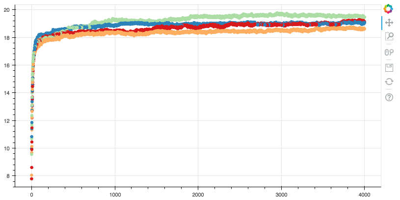
Add color to your plots by factor!
(Bokeh 0.12.7)