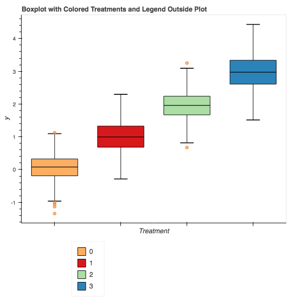
The current version of Bokeh 0.12.10 broke some previous functionality for boxplots and required building a boxplot from the ground up. Unfortunately, the example code provided in the user guide colors each box based on the upper and lower boxes, rather than by the factor value. This example code instead colors by factor, and places the legend outside the bounding box. Full source code of this notebook is provided at: Bokeh Notebook Example.
First, we import the required packages, primarily pandas and bokeh.
import pandas as pd
import random

from bokeh.io import output_notebook
from bokeh.plotting import figure, output_file, show
from bokeh.models import ColumnDataSource
Next, we create some sample data. Not the most interesting, but formatting by factor and value allows us to create the boxplot.
# Generate some synthetic data.
df = pd.DataFrame({
    'Treatment':[str(i) for i in range(4) for j in range(100)],
    'y':[random.gauss(i, 0.5) for i in range(4) for j in range(100)]
})
df.head()
Now that we have some data, we first need a way to figure out how many colors we need. I wrote this convenience function to look at the data frame and figure out how many unique values are in the given column. Thus, we are coloring based on that column and pulling from the Spectral template built into bokeh.palettes. This function was adapted from the links provided in the code comments.
from bokeh.palettes import brewer
def color_list_generator(df, treatment_col):
    """ Create a list of colors per treatment given a dataframe and
        column representing the treatments.

        Args:
            df - dataframe to get data from
            treatment_col - column to use to get unique treatments.

        Inspired by creating colors for each treatment
        Rough Source: http://bokeh.pydata.org/en/latest/docs/gallery/brewer.html#gallery-brewer
        Fine Tune Source: http://bokeh.pydata.org/en/latest/docs/gallery/iris.html
    """
    # Get the number of colors we'll need for the plot.
    colors = brewer["Spectral"][len(df[treatment_col].unique())]

    # Create a map between treatment and color.
    colormap = {i: colors[k] for k,i in enumerate(df[treatment_col].unique())}

    # Return a list of colors for each value that we will be looking at.
    return [colormap[x] for x in df[treatment_col]]
The full code for the boxplot creating is below. We first get the colors needed for the treatments, four in our case. Next, get the categories we will be plotting by. Quartiles and interquartile range are then calculated. ‘upper_source’ and ‘lower_source’ are ‘ColumnDataSource’ objects needed to create the upper and lower quartile boxes for the boxplot. They are essentially dictionaries but with additional features documented in Bokeh. Here we specify not only the treatment values, but also the colors that we will fill each box by. Outliers are then identified and kept in their own data source.
The key insight of the Bokeh process is that the boxplot is built up by components, whiskers, vertical lines and boxes. Each of these calls is made using ‘segment’, ‘vbar’, and ‘rect’ calls. However, even though we have multiple treatments, by using the ‘ColumnDataSource’ objects, we are able to make one call to create a geom object for each treatment.
Finally, placing the legend outside the plot requires a bit of wrangling. This new feature in more recent versions of Bokeh is not well documented. We must build the legend ourselves and then place it manually. This can be done in two lines of code. The first creates the ‘Legend’ object by using the ‘vbar’ return renderer saved in the ‘l’ variable. Combining this with the ‘ColumnDataSource’ provided to the original renderer, we create the legend with four values, each corresponding to a treatment. Finally, we add the legend to the plot manually.
# Generate a boxplot of the maximum fitness value per treatment.
import numpy as np

from bokeh.models import Legend, LegendItem
from bokeh.plotting import figure, show, output_file

output_notebook()

# Get the colors for the boxes.
colors = color_list_generator(df, 'Treatment')
colors = list(set(colors))

# Get the categories that we will be plotting by.
cats = df.Treatment.unique()

# find the quartiles and IQR for each category
groups = df.groupby('Treatment')
q1 = groups.quantile(q=0.25)
q2 = groups.quantile(q=0.5)
q3 = groups.quantile(q=0.75)
iqr = q3 - q1
upper = q3 + 1.5*iqr
lower = q1 - 1.5*iqr

# Form the source data to call vbar for upper and lower
# boxes to be formed later.
upper_source = ColumnDataSource(data=dict(
    x=cats,
    bottom=q2.y,
    top=q3.y,
    fill_color=colors,
    legend=cats
))

lower_source = ColumnDataSource(data=dict(
    x=cats,
    bottom=q1.y,
    top=q2.y,
    fill_color=colors
))

# find the outliers for each category
def outliers(group):
    cat = group.name
    return group[(group.y > upper.loc[cat]['y']) | (group.y < lower.loc[cat]['y'])]['y']
out = groups.apply(outliers).dropna()

# prepare outlier data for plotting, we need coordinates for every outlier.
if not out.empty:
    outx = []
    outy = []
    for cat in cats:
        # only add outliers if they exist
        if not out.loc[cat].empty:
            for value in out[cat]:
                outx.append(cat)
                outy.append(value)

p = figure(tools="save", title="", x_range=df.Treatment.unique())

# stems (Don't need colors of treatment)
p.segment(cats, upper.y, cats, q3.y, line_color="black")
p.segment(cats, lower.y, cats, q1.y, line_color="black")

# Add the upper and lower quartiles
l=p.vbar(source = upper_source, x='x', width=0.7, bottom='bottom', top='top', fill_color='fill_color', line_color="black")
p.vbar(source = lower_source, x='x', width=0.7, bottom='bottom', top='top', fill_color='fill_color', line_color="black")

# whiskers (almost-0 height rects simpler than segments)
p.rect(cats, lower.y, 0.2, 0.01, line_color="black")
p.rect(cats, upper.y, 0.2, 0.01, line_color="black")

# outliers
if not out.empty:
    p.circle(outx, outy, size=6, color="#F38630", fill_alpha=0.6)

# Using the newer autogrouped syntax.
# Grab a renderer, in this case upper quartile and then
# create the legend explicitly.
# Guidance from: https://groups.google.com/a/continuum.io/forum/#!msg/bokeh/uEliQlgj390/Jyhsc5HqAAAJ
legend = Legend(items=[LegendItem(label=dict(field="x"), renderers=[l])])

p.add_layout(legend, 'below')

# Setup plot titles and such.
p.title.text = "Boxplot with Colored Treatments and Legend Outside Plot"
p.xgrid.grid_line_color = None
p.ygrid.grid_line_color = "white"
p.grid.grid_line_width = 2
p.xaxis.major_label_text_font_size="0pt"
p.xaxis.major_label_orientation = np.pi/4
p.xaxis.axis_label="Treatment"
p.yaxis.axis_label="y"
p.legend.location = (100,10)

show(p)
The final result should look something like this:

While perhaps not the most straightforward process compared to other plotting packages, Bokeh gives us the ability to build plots optimized for the web and additional features over just a static object. This code can of course be wrapped in a function and made part of a library, but that will be upcoming.
